How The Odyssey could inspire your next campaign
What the images in your next email campaign could borrow from Christopher Nolan's masterpiece.
 James
James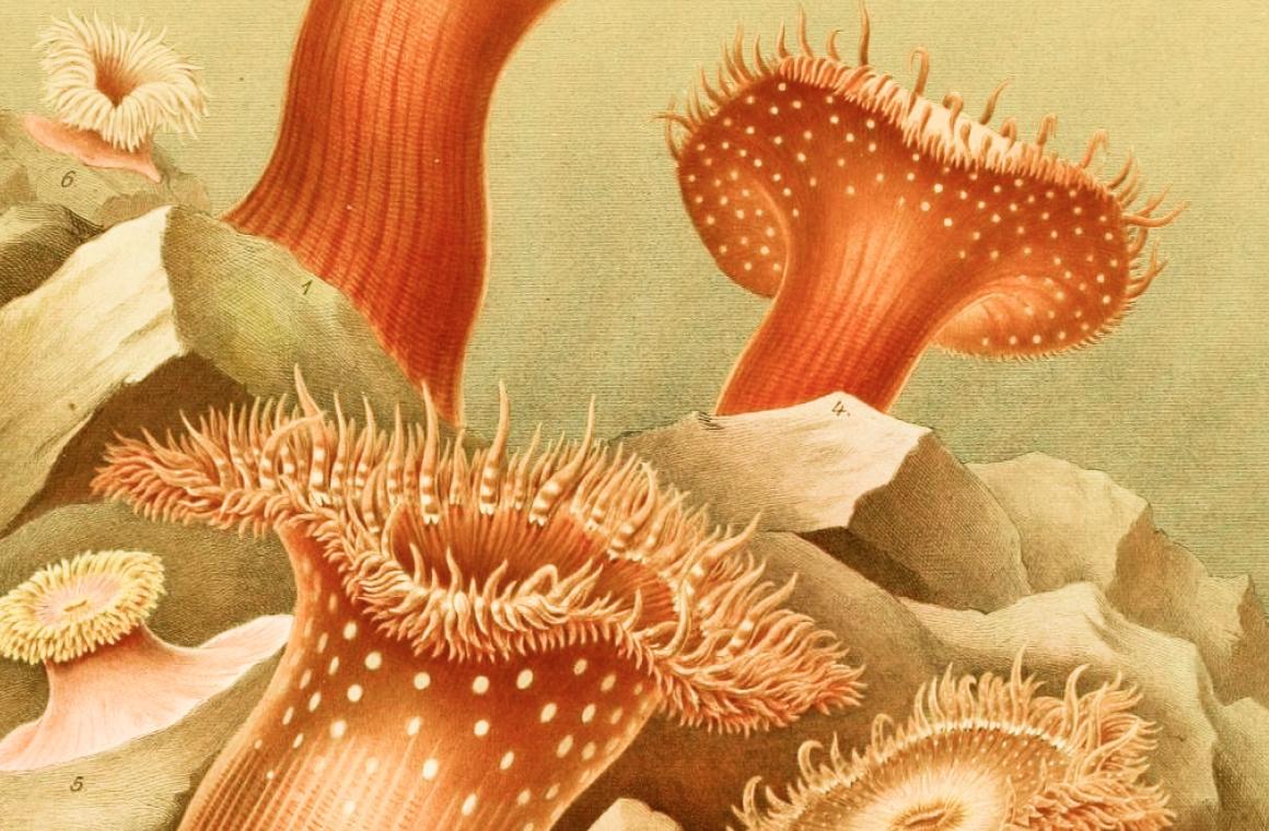
The screen is the same size for every story. A shot of a teacup is the same size as an army coming over the hill. It’s all storytelling.
— Sir Christopher Nolan (British and American filmmaker)
Christopher Nolan and his team have spent hundreds of millions of dollars making sure every single frame of The Odyssey is worth looking at.
So in this week’s edition we’re going to discuss how you can raise your marketing budget to do just that.
Just kidding, of course. Most of us can only dream of having the time, money, and multidisciplinary talent that go into making a blockbuster movie.
But there’s a lot we can take from the world of movies that applies to email marketing.
Almost every email we send has a story, a viewpoint, a goal, a frame… and an image.
An image vs a thousand words
Today we’re talking about those images — they tell their own story. Whether we intend them to or not.
Images in email are rarely decided. They're usually grabbed.
The photo that was already in the folder. The stock shot that was fine from last year. The logo, because the space looked a bit empty.
The images are often hastily thrown together, while the words get multiple rounds of edits and a debate about a comma.
Filmmakers don't work that way. They obsess over what the audience sees, because they know it's doing most of the emotional work.
I think email marketers should too. But what does that look like in practice?
Here are a few thoughts on using images to take your next campaign to Troy and back.
Fill the frame
One of the reasons IMAX feels so immersive is that it fills your field of view. There's nowhere else to look.
While the screen is usually a fraction smaller, email can work the same way. Your hero image should make the reader feel like they're there — not like they're looking at a location from across the car park.
Most photos are simply taken from too wide of an angle.
For example, instead of the entire museum exterior, choose someone standing close in front of a painting.
Instead of the whole concert venue, choose a face in the crowd, mid-cheer.
Instead of a generic charity logo, choose the person your work exists to help.
Tighter framing can often lead to stronger emotion.
Wide shots explain where. Tight shots make people feel something. In a 600px-wide email being read on a phone on the bus, you almost always want the second one.
Every frame should earn its place
This is a famous filmmaking principle: every shot should exist for a reason. If it doesn't advance the story, it gets cut — however expensive it was to film.
Exactly the same applies to email.
Ask this of every image in your campaign:
- Does it create curiosity?
- Does it create emotion?
- Does it explain something that words would labour over?
- Does it persuade?
If the honest answer is no — you probably want to cut it.
Not because images are bad, but because a decorative image isn't neutral. It costs load time. It pushes your call to action further down the screen. It adds weight to every single copy you send. And it dilutes the other images that actually matter.
Three good images beat eight adequate ones, every time.
As we often say: email isn't free. And neither is a frame that isn't doing any work.
The director's cut
You rarely need (or have) a better photo. You need a better version of the photo you’ve already got.
Take one image and run it through the cut:
Crop it tighter. Get your subject filling the frame.
Straighten it. A level horizon reads as "professional" before anyone consciously knows why. A wonky one reads as "rushed" just as fast.
Nudge the brightness. Most phone photos are a touch flat straight out of the camera.
Optimise the aspect ratio. The same picture can be transformed when you adjust the frame — like making a portrait photo landscape or vice versa.
That’s four small moves that don’t require Photoshop, design requests, or waiting on anyone else's calendar.
A practical example
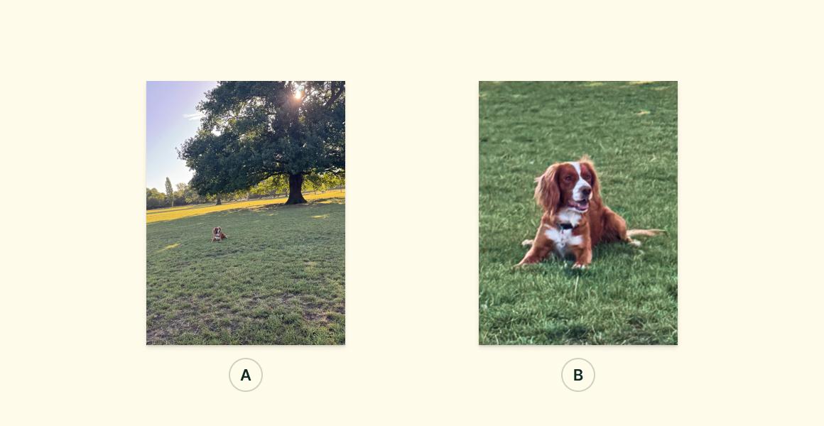
Let’s take a look at two versions of the same photograph.
Version A: Hugo, somewhere in a field. A small brown speck near the treeline. Lovely day. Nice field.
Version B: A tight crop. Hugo fills the frame, ears up, alert, looking towards something that has caught his attention.
It's the same (pretty average) photo. But it tells a different story.
One is a picture of a field with a dog. The other is a picture of a dog who has spotted something.
That single crop, with a little rotation, is a very basic but impactful intro to composition — and it took about ten seconds.
Whatever's going in your next campaign, see if you can discover the version of it that's Version B.
Argus’s Hugo's eye for detail
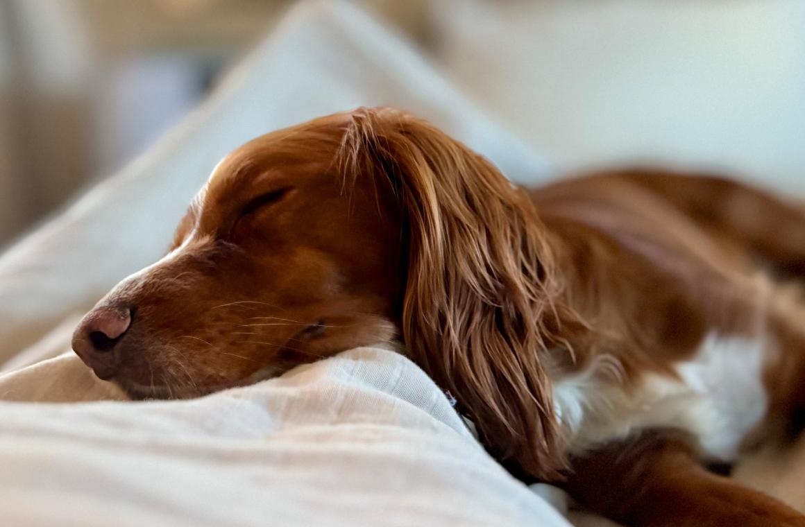
As anyone who has read or watched The Odyssey will know: dogs notice things.
The closest we have to trusty old Argus is our very own Hugo (shown above, waiting for his master to return home).
If Hugo were reviewing your next campaign, he'd probably notice:
- The horizon isn't straight.
- That image is four times bigger than it needs to be.
- The subject is tiny in the frame.
- That stock photo doesn't make me feel anything.
Good imagery is mostly about noticing the little things.
Editing images inside EcoSend
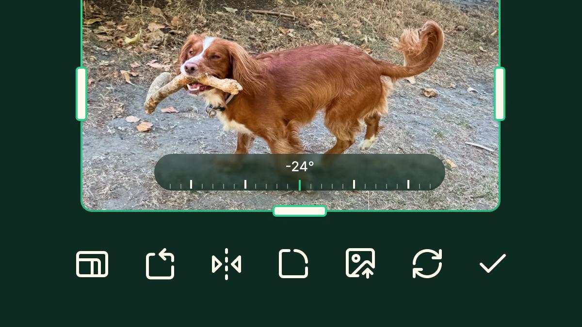
You can now perform basic edits on your images inside EcoSend, with inline image editing.
It's right in the email builder — so you can crop, straighten, flip, add borders, and replace images without ever leaving your campaign.
We hope it’s an update that will change your emails forever.
Try it now
Open your last campaign and pick one image — the hero is a good place to start.
Crop it tighter, straighten it, brighten it slightly, and see whether the whole email suddenly feels art-directed rather than assembled.
If you're not yet using EcoSend, you can get started completely for free, with no billing details or commitment required. You can also have a play with creating an entire email without signing up at all, using our free email builder.
And if you do give it a go, hit reply with a before-and-after. I'd genuinely love to see one.
So would Hugo.
Until next time,
James
The illustration at the top of this edition is Sea anemones from the Bay of Naples. Plate from Le attinie by Angelo Andres (Leipzig: W. Engelmann, 1884), part of Fauna und Flora des Golfes von Neapel. This was a survey of everything living off the Neapolitan coast. It's the same water Homer sent Odysseus through: Sirens on the rocks to the south, Scylla and Charybdis a little further on. Public domain, via the Biodiversity Heritage Library.
The newsletter for purpose-driven marketers
Join hundreds of marketers getting weekly insights on ethical email marketing, sustainable growth, and responsible digital practices.
Unsubscribe anytime. No spam. No nonsense.