How to make your emails work in dark mode
What does dark mode do to your emails? And how do you design for it without a developer?
 James
In visual perception a colour is almost never seen as it really is — as it physically is.
— Josef Albers (artist and teacher, Interaction of Color)
In the UK, it's getting dark rather early.
The clocks have gone back, it's pitch black before most of us have finished work, and it’s that time of the year where many of us are stood in a muddy field going "ooooh" at fireworks. (Happy bonfire night, if you celebrate!)
So it feels like the right week to talk about dark mode.
Dark mode is one of those features that's absolutely everywhere: on your phone, your laptop, probably the very app you're reading this in.
And yet in the world of email, we rather conveniently hardly ever talk about it.
Litmus (a popular email testing platform) found that around a third of the email opens it tracked in 2022 were in dark mode. That's a lot of people seeing a version of your email you might never have looked at in the design stage.
This week's issue was also prompted by Dom Cooper, Strategic Director at Vu Digital (a fellow B Corp agency down in Devon and Cornwall, and a long-time EcoSend customer).
Vu Digital have just redesigned their website and brand, and their emails along with it. Dom sent me a video this week walking through how the new design was behaving in light and dark mode, and it's a question that comes up a lot. So, thank you Dom! Let's go through it properly.
(If you’re an eagle-eyed reader you might have seen that we shipped dark mode for the EcoSend app itself a fortnight ago, so we’ve been squinting at light and dark versions of things for weeks.)
What dark mode does to your email
When a reader has dark mode switched on, their email app has to decide what to do with your carefully designed, probably light-coloured email.
It’s worth bearing in mind, we’re primarily talking about HTML emails here — i.e. visual emails like newsletters and announcements and invitations and anything you’d traditionally consider a campaign in email marketing parlance.
For plain-text emails, the story is quite simple: colour is not part of the email, so your email will show up entirely as your email client wants it to. Light in light mode, dark in dark mode, and pink if the reader’s phone has a theme that does that. As the name explains: it’s just plain text. Styling and colour are not part of the equation.
Broadly, dark mode does one of three things to HTML email:
- Nothing. Your email shows exactly as you designed it, bright white background and all, inside a dark app interface. Gmail on a desktop browser does this, for example.
- A partial flip. Light backgrounds get turned dark, and anything that's already dark is left alone. This is the most funky one. The Gmail app on Android and the Outlook phone apps sometimes do this.
- A full flip. Light bits go dark and dark bits go light. This is the most heavy-handed version, and it's what the Gmail app on iPhone and Outlook on Windows tend to do.
With Apple Mail it depends on how your email is built. Which is the most email-design answer possible.
You don't get to choose which of these your reader gets. The same email can look three different ways on three different devices, all on the same evening. Heck, even to the same reader.
If you’ve ever spent more than an hour on email design you’ll know that still, in 2026, in many ways, email is still stuck in the 90s.
Five dark mode gotchas, and what to do about each
1. Your logo disappears
The classic and most common issue. You've got a lovely logo with dark text and a beautiful emblem, saved as a transparent PNG so it sits neatly on your light coloured background.
Now the reader’s device has changed the background to dark grey, and your dark logo has vanished into it.
Fix: give the logo a subtle light outline or glow. Litmus recommends this for transparent images with dark text. You could also put it on a solid shape, like a white rounded rectangle or a circle, so it has its own background guaranteed to give contrast.
2. White boxes appear out of nowhere
The opposite problem to our logo issue. A product photo, chart or screenshot with a white background baked into it might look fine on white. On a dark background, it's a glaring ugly white rectangle which crowds out the very content of the image.
Fix: you could use a transparent version, if the contrast works on both dark and light backgrounds. Or you can lean into the box. Give the image itself a little padding and some rounded corners so it looks deliberate rather than accidental. Litmus also suggests leaving enough space around the focal point of an image so it doesn't look awkward against a dark background.
3. Your brand colours get "fixed" for you
In the apps that fully invert the colours of your email, your colours might be changed for you. A deep brand green on your buttons might show up as something you'd never have picked.
Fix: the harsh reality here is you can't stop this everywhere. So the best bet is to choose colours that work on both light and dark backgrounds. You want to choose mid-tones with enough contrast against white and black as they will survive best.
And as we have discussed under the banner of accessibility many times, you want to avoid relying on colour alone to carry meaning. For example “click the green button” can be misleading because the green might not be green.
4. Text inside images never flips
Another topic we have discussed in relation to accessibility is when to use text in images. The summary is: as rarely as possible, and ideally never.
Any words baked into an image, like a header graphic, an event poster, or a "SALE" banner, will stay exactly as they are while everything around them can change.
Dark text on a transparent image can become unreadable, and it's already lost for anyone who has images turned off, or relies on a screen reader. It’s a good reminder, just in case, to always make sure you've written good alt text for each of your images.)
Fix: whenever possible, put your words in real text and keep images purely for pictures. It’s good for accessibility, good for email weight, and it's one less thing for dark mode to break.
5. Coding a dark version only works in some places
If you (or your developer) are comfortable with code, you can add styles to craft a dark version of your email.
This is the nerdiest advice in this piece, but here goes. You need to use a bit of CSS called prefers-color-scheme. Apple Mail displays your emails largely as Safari does, so it supports this. Outlook partly does(!), and Gmail doesn't support it at all. Can I Email? puts overall support at roughly 42% of email clients.
Here’s an example of the code you’d put into your HTML email to explicitly define your background and link colours in both light and dark mode:
.my-background {
  background-color: #FFFBEC;
}

a {
  color: #0D2B22;
}

@media (prefers-color-scheme: dark) {

  .my-background {
    background-color: #0D2B22;
  }

  a {
    color: #FFFBEC;
  }

}
Now, don’t worry if this is gobbledegook to you. You really don’t need to worry about this unless you’re already designing and coding your emails by hand anyway.
The danger of this route is you can spend a whole afternoon perfecting a dark mode version that most of your audience will never see.
Fix: for most small teams, design one email that holds up on both backgrounds, rather than crafting styles that apply in both modes. If you do go to the effort of coding a dark version, think of it as a bonus for those lucky Apple Mail readers, rather than the solution for everyone.
Don't force light mode
If you search the internet for advice on this topic, you’ll find code tricks that try to stop email apps changing the colours of your email. Some of them work, sometimes.
Our advice is to use these approaches sparingly, if at all. Your readers switch on dark mode for good reasons: their eyes are aching, they’re reading late at night, they have a headache, or just because they like it. Even Litmus, who publish the tricks, warn that forcing light-mode colours "run[s] the risk of disrespecting your users' preference."
It's their screen — your job is to make sure your emails still work on it.
The sustainability argument for dark mode
Given our obsession with digital sustainability, you might be wondering about the energy angle. In 2021, so a few years ago now, researchers at Purdue University found that dark mode on OLED phones saved 39–47% of battery at full brightness. That’s pretty significant!
The catch is that the savings reduced significantly, to only 3–9% when devices were used at the brightness most of us actually use (30–50%). So it's an every use win, but not a huge one. Dark mode is primarily about comfort, and accessibility, and those two are very good reasons alone.
Remember, remember, dark mode in November
If you only remember one thing: design for both light and dark backgrounds, not just one.
- Give your logo a light outline, or on its own solid shape.
- Ensure images are either transparent or deliberately boxed.
- Set brand colours that work on light and dark mode.
- Put words in real text, not in images.
- Don't fight your reader's settings.
And the plainer your email, the fewer things dark mode can break. (Another quiet win for simple, clean emails.)
Try it now
Switch your phone (or computer) to dark mode. Then open a recent campaign in whichever email app most of your readers use. If you don't know, try the Gmail app and Apple Mail as these are by far the most popular globally.
Screenshot the top of the email and look for the following:
- Can you see your logo?
- Are there any glaring white boxes?
- Is there any text you can't comfortably read?
Fix the worst one in your template, so every email from now on gets the fix.
Found something you’re proud of? Or embarrassed by? Hit reply to this email and send me your screenshot, especially if something has gone horribly wrong. I'll happily take a look and tell you what I'd change. And I promise I’ll keep it between us!
Until next time,
James
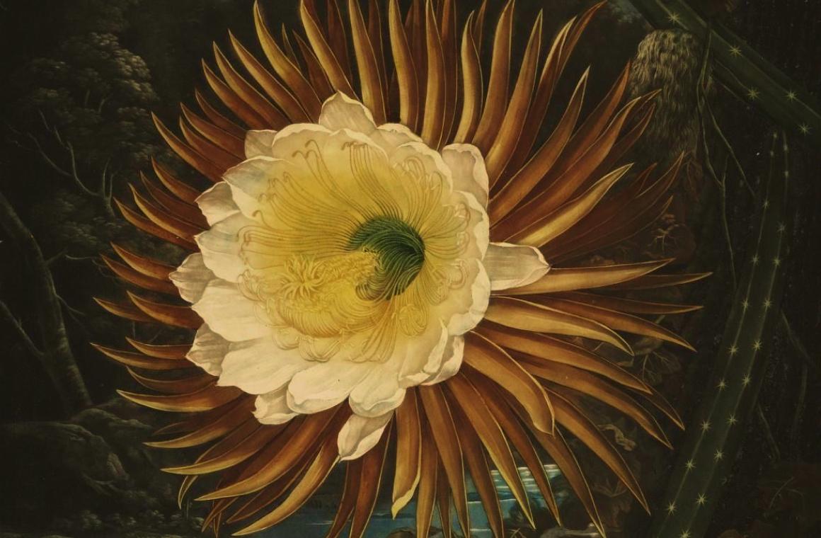
This week's illustration is The Night-Blowing Cereus from Robert John Thornton's New Illustration of the Sexual System of Carolus von Linnaeus (London, 1807), the plates better known as The Temple of Flora, via the Biodiversity Heritage Library. Philip Reinagle painted the flower and Abraham Pether the moonlit scene behind it. Supposedly, the flower only blooms at night, so it's been on dark mode for a couple of centuries longer than most of us.
Upcoming: email accessibility masterclass
This Tuesday, 10th November, we're hosting a free online masterclass on email accessibility with our friends at Conscious Marketing Movement. Plenty of this week's fixes (real text, good contrast, good alt text) are accessibility fixes too. RSVP and get it in your calendar.
The newsletter for purpose-driven marketers
Join hundreds of marketers getting weekly insights on ethical email marketing, sustainable growth, and responsible digital practices.
Unsubscribe anytime. No spam. No nonsense.