Stop designing emails like webpages
Your email isn't a tiny website. Here's how to design it like an email.
 James
James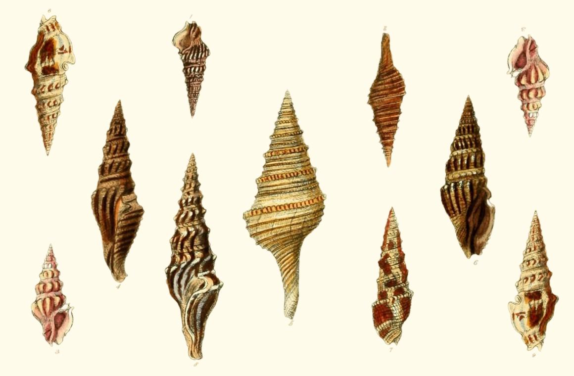
Perfection is achieved, not when there is nothing more to add, but when there is nothing left to take away.
— Antoine de Saint-Exupéry (French writer, poet, and aviator)
There's a temptation, when designing an email, to think of it as a little webpage.
Add a navigation bar. A big hero. Three columns. A handful of cards. Some buttons. A footer packed with links.
And before you know it, you've built a homepage that happens to arrive in someone's inbox.
But email is a different medium — and the best email design leans into that rather than fighting it.
Your reader is probably in a hurry
When someone visits your website, there's at least some intent behind it. They chose to go there.
An email is different.
It arrives among meeting invitations, receipts, newsletters, delivery updates and thirty-seven other things demanding attention.
You're lucky if you have seconds to make someone care.
So rather than asking "how do we fit everything in?", ask:
If someone only gives us five seconds, what do we want them to take away (or do)?
That question can often lead to much better emails.
Embrace the scroll
Websites need navigation because they contain lots of information and people need to find their way around.
Emails have a wonderful advantage: they only really go in one direction. Down!
You can use that as a constraint to breed creativity: Create a clear hierarchy. Lead with the most important thing. Let one idea naturally follow another.
And, I'll let you into probably the biggest secret from my many years of pushing pixels around on screens: don't be afraid of space.
A little breathing room between sections can do more for readability than another border, box or background colour ever will.
Let images do some work
As we touched on last week, a great image can communicate something before you've written a word.
If you're announcing an exhibition, show the work. If you're promoting an event, show people enjoying it. If you're sharing your charity's impact, show the people, places or things behind the numbers.
Images shouldn't just decorate the email. They can help tell the story.
And of course, they don't need to be enormous, heavy files either. Optimising images keeps emails lighter and faster to load — which matters most for the person reading on their phone, halfway through a commute, on patchy data.
(EcoSend optimises every image automatically, by the way, so that one's taken care of.)
Give your recipients fewer choices
One of the easiest ways to improve an email is to remove something.
If you have seven buttons competing for attention, none of them feels particularly important.
Instead, decide what the email is really asking someone to do.
Read the story. Book a ticket. Donate. Register. Reply.
You can still include secondary information — but give the primary action room to breathe, and make it unambiguously the top priority.
Design for the inbox, not the browser
The best emails are not miniature websites.
They tend to be simple. Linear. Focused. And often can be more personal.
So next time you're putting an email together, resist the urge to fill all of the available space.
Try focusing on one idea, with a clear hierarchy, some great imagery, and a little more breathing room than usual.
Your website can take on the heavy lifting.
Try it now
Open your last campaign and count the number of things you're asking someone to click.
If it's more than two or three, try building the same email again with one — and see whether it reads better, not worse.
If you're not yet using EcoSend, you can get started completely for free, with no billing details or commitment required. Or have a play with our free email builder without signing up at all.
And if you do strip something back, hit reply and send me the before and after. I'd love to see what came out.
Until next time,
James
P.S. This week has been a big one at EcoSend — we shared our summer update (including a little cameo from our head of customer happiness Hugo), and our first ever Impact Report. That's a recap of our first year as a B Corp — oh how time flies!
The illustration at the top of this edition is from Lovell Reeve's Conchologia systematica, or Complete system of conchology (London: Longman, Brown, Green and Longmans, 1841–42). Every shell on it was built by a single animal in a single unbroken spiral, starting from that tiny point at the top and never once branching. Reeve could have filled the page many times over with these illustrations. Public domain, via the Biodiversity Heritage Library.
The newsletter for purpose-driven marketers
Join hundreds of marketers getting weekly insights on ethical email marketing, sustainable growth, and responsible digital practices.
Unsubscribe anytime. No spam. No nonsense.